I am a multidisciplinary artist & designer living and working out of Vancouver, BC.
Get to know me here!

Say hi!
01 EISHOCKEY
TYPE DESIGN
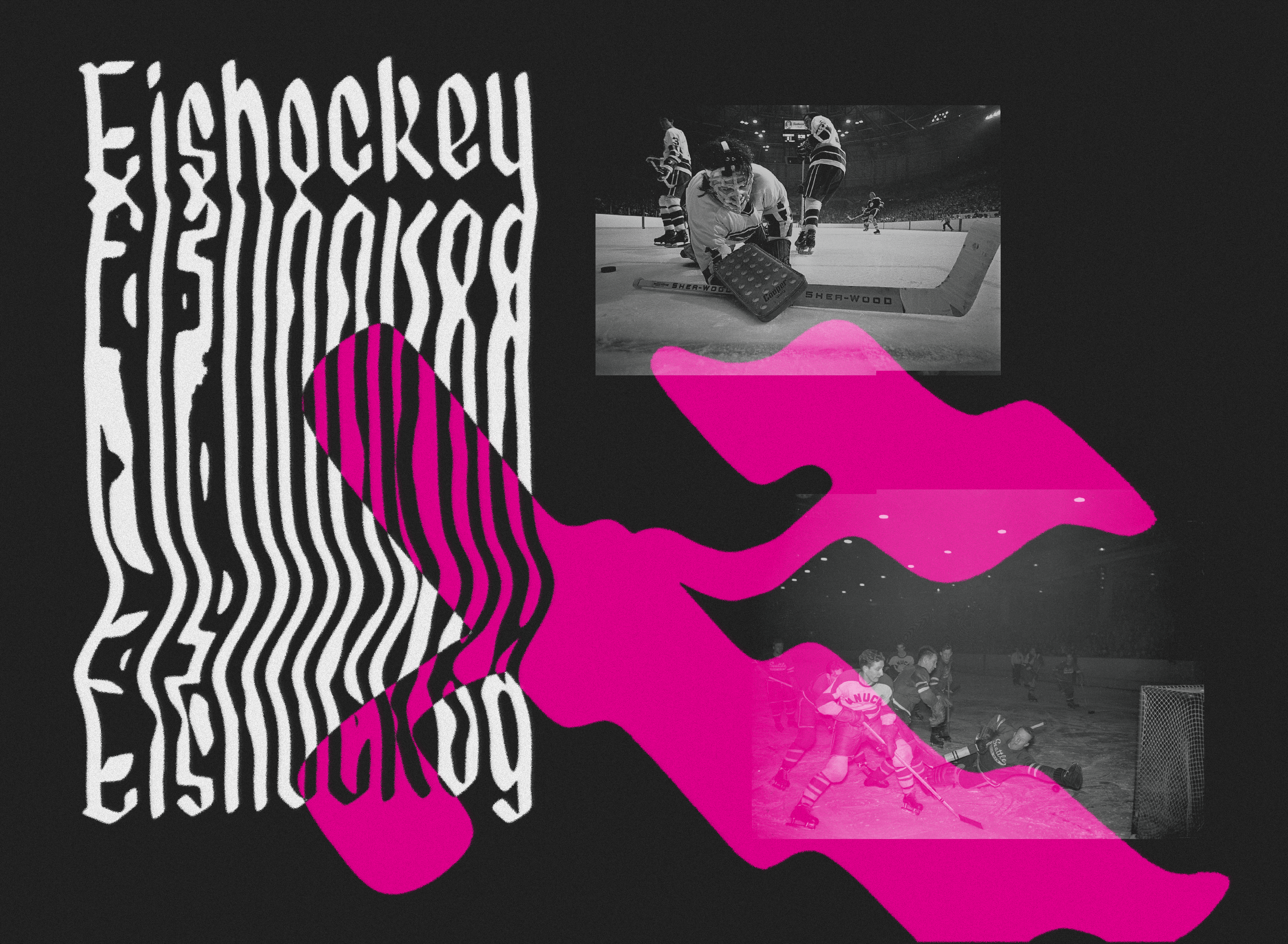
FEBRUARY 2020
Personal Project
Type Design
︎︎︎ Created with Glyphs
Personal Project
Type Design
︎︎︎ Created with Glyphs
Eishockey is a limited display typeface, consisting of only an uppercase set and a lowercase set, that transforms a traditional black letter typeface through smooth curves and rounded corners.
Reach out via email if you’d like to use this typeface!
Reach out via email if you’d like to use this typeface!
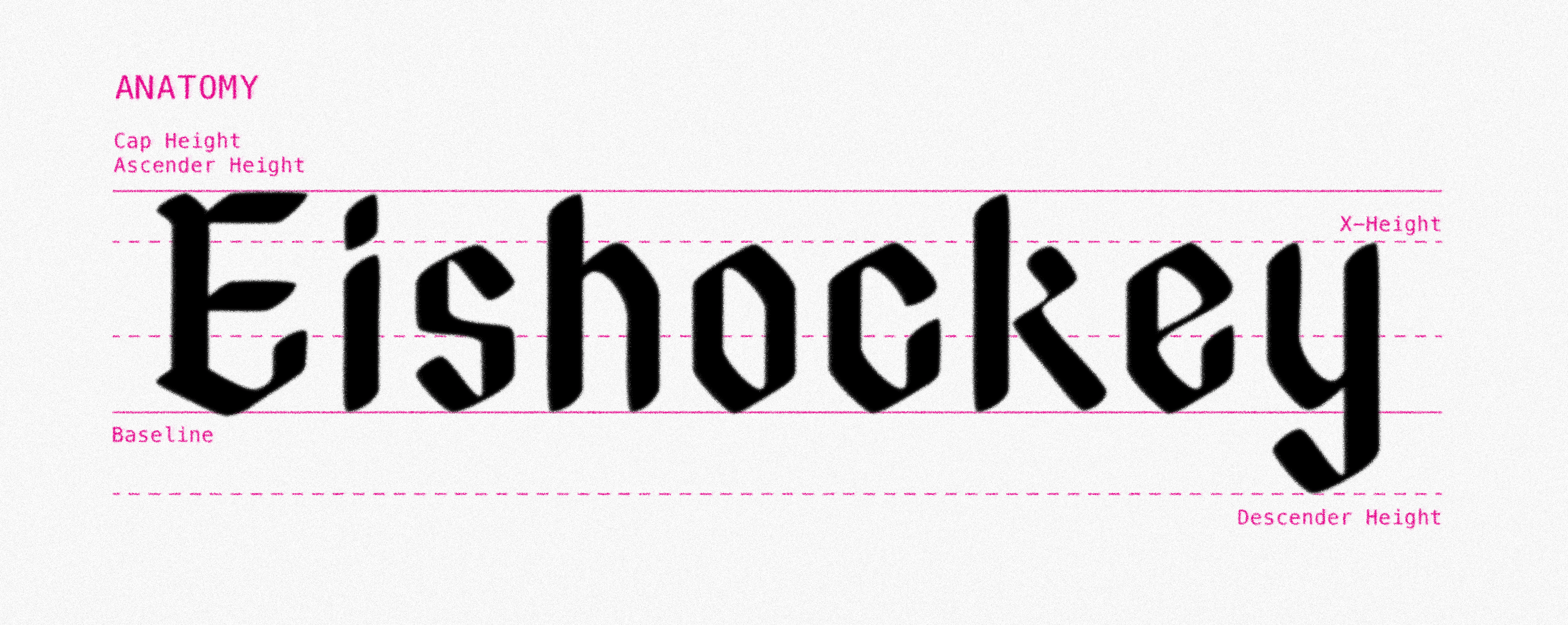
ALL GLYPHS

