02 THE GOBLIN MARKET
DESIGN

OCTOBER 2019
Personal Project
Typography, Flyers, Installation.
︎︎︎ 8.5” x 11”, 4” x 11”, 4”x 7”
︎︎︎ print, sharpie, ballpoint pen
Personal Project
Typography, Flyers, Installation.
︎︎︎ 8.5” x 11”, 4” x 11”, 4”x 7”
︎︎︎ print, sharpie, ballpoint pen
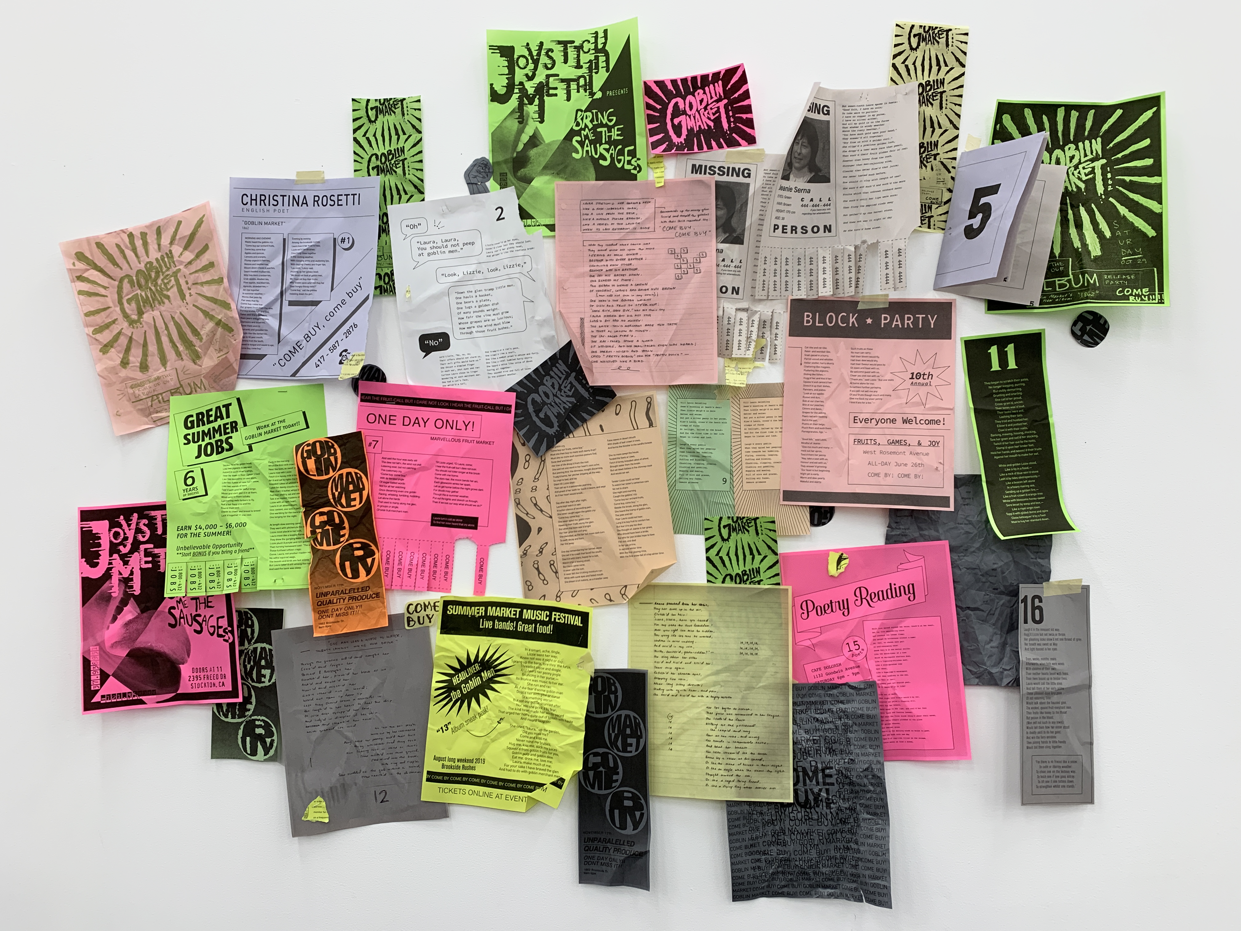
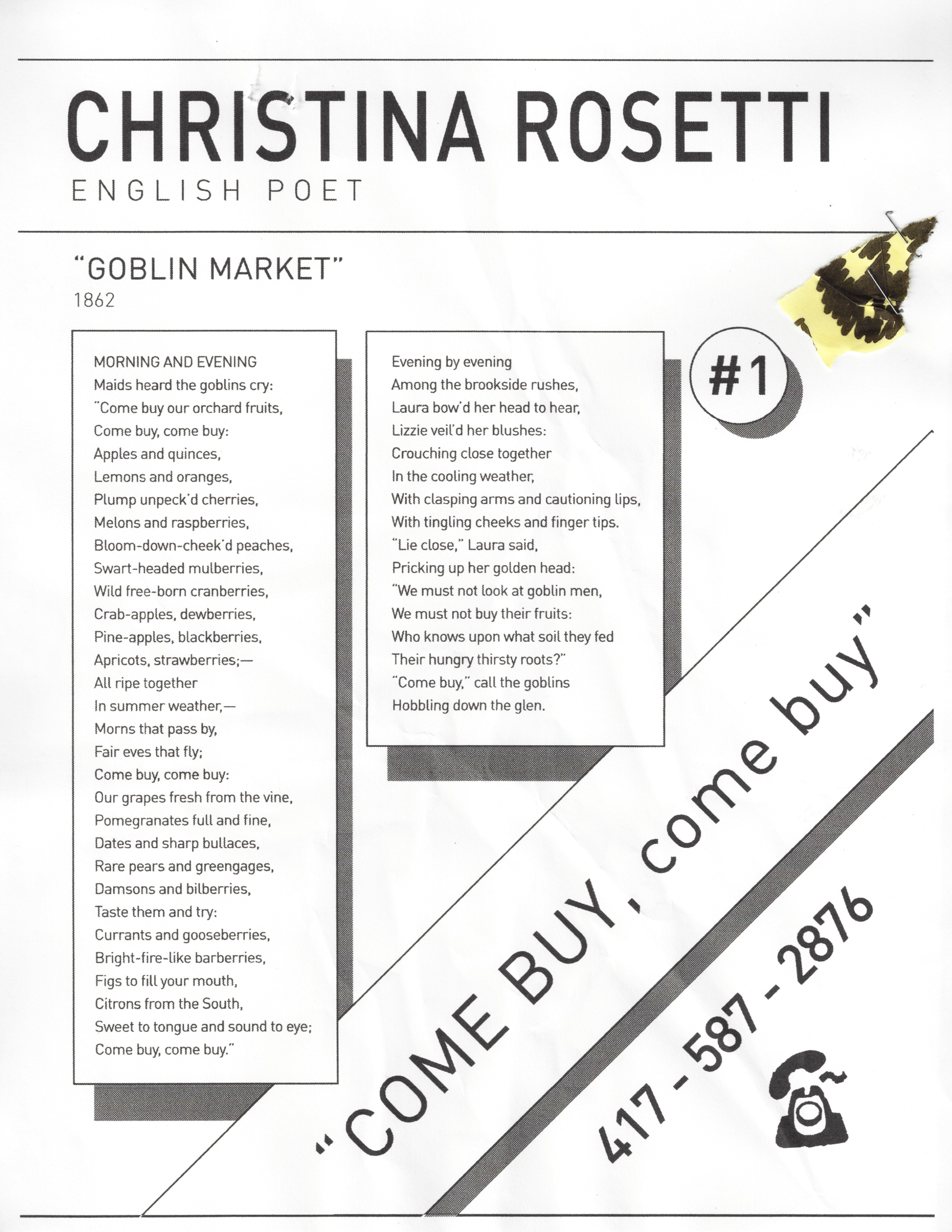
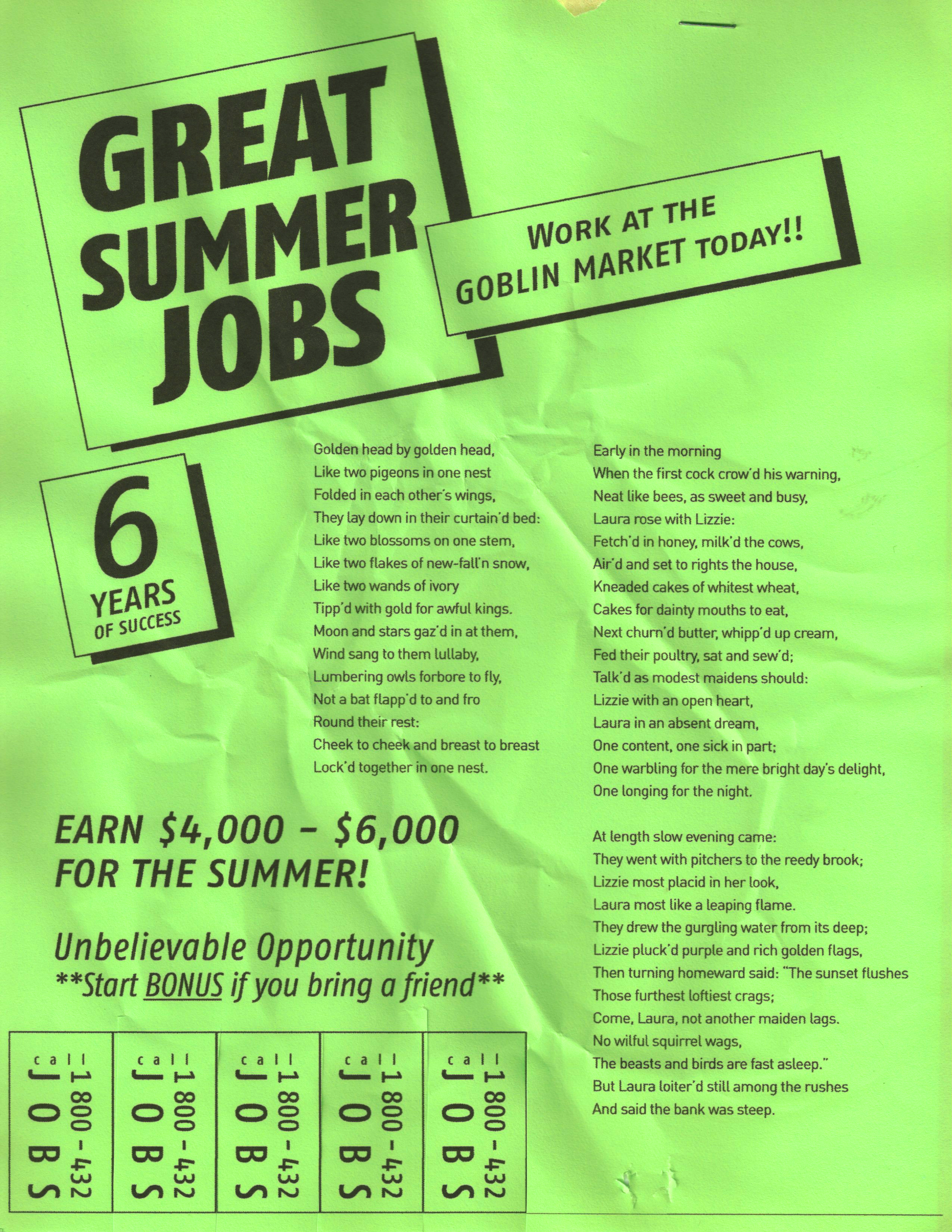
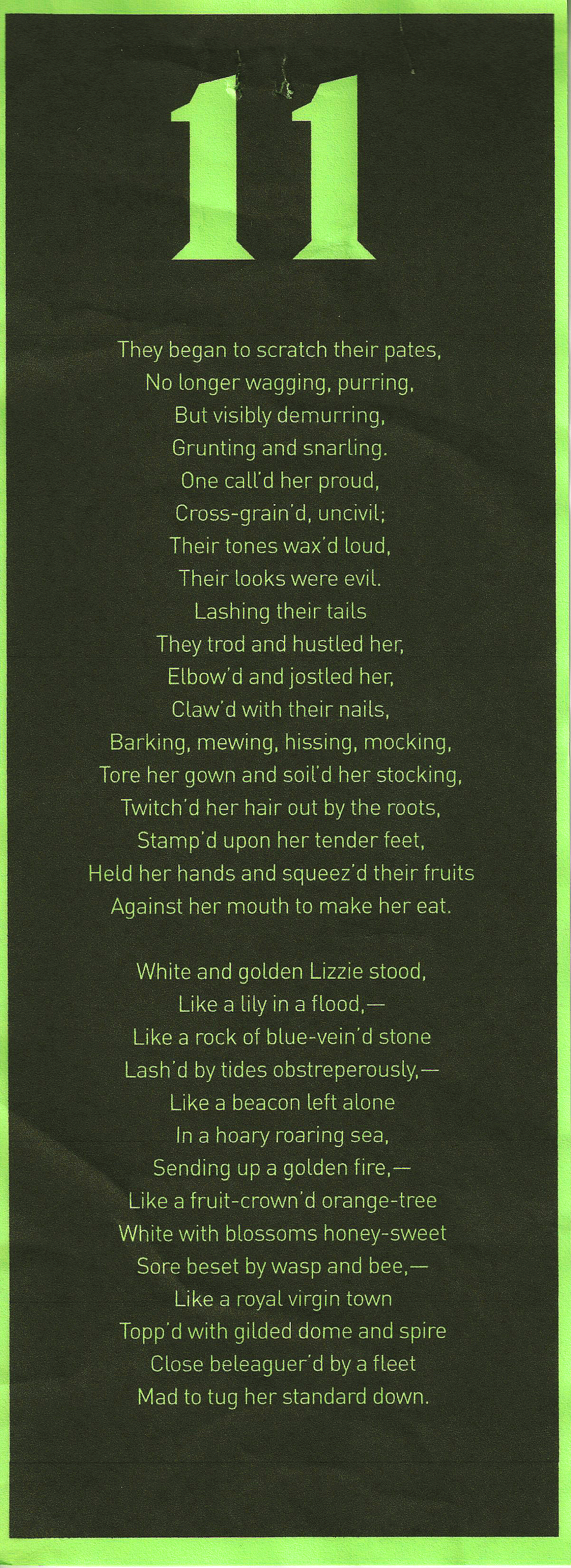
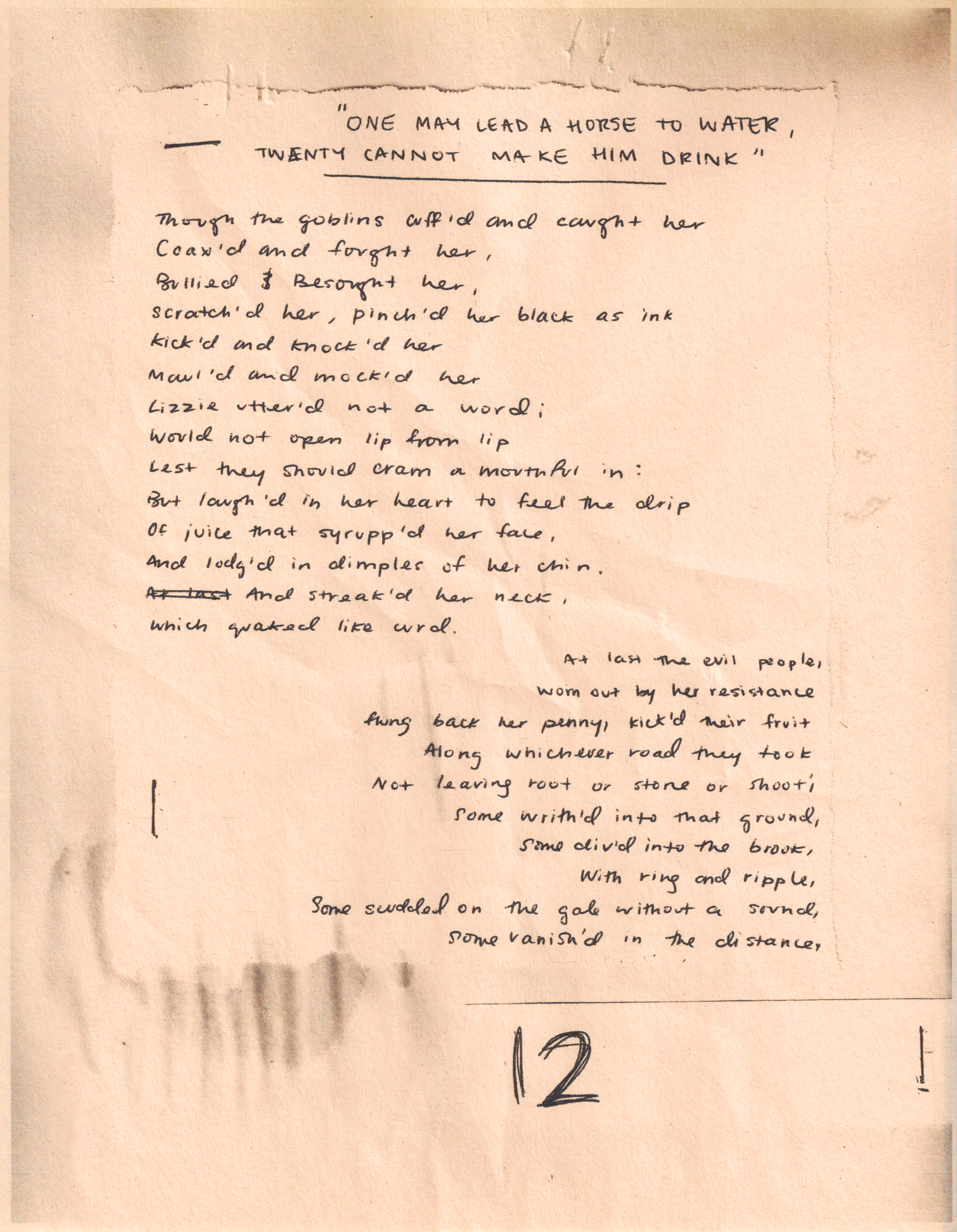
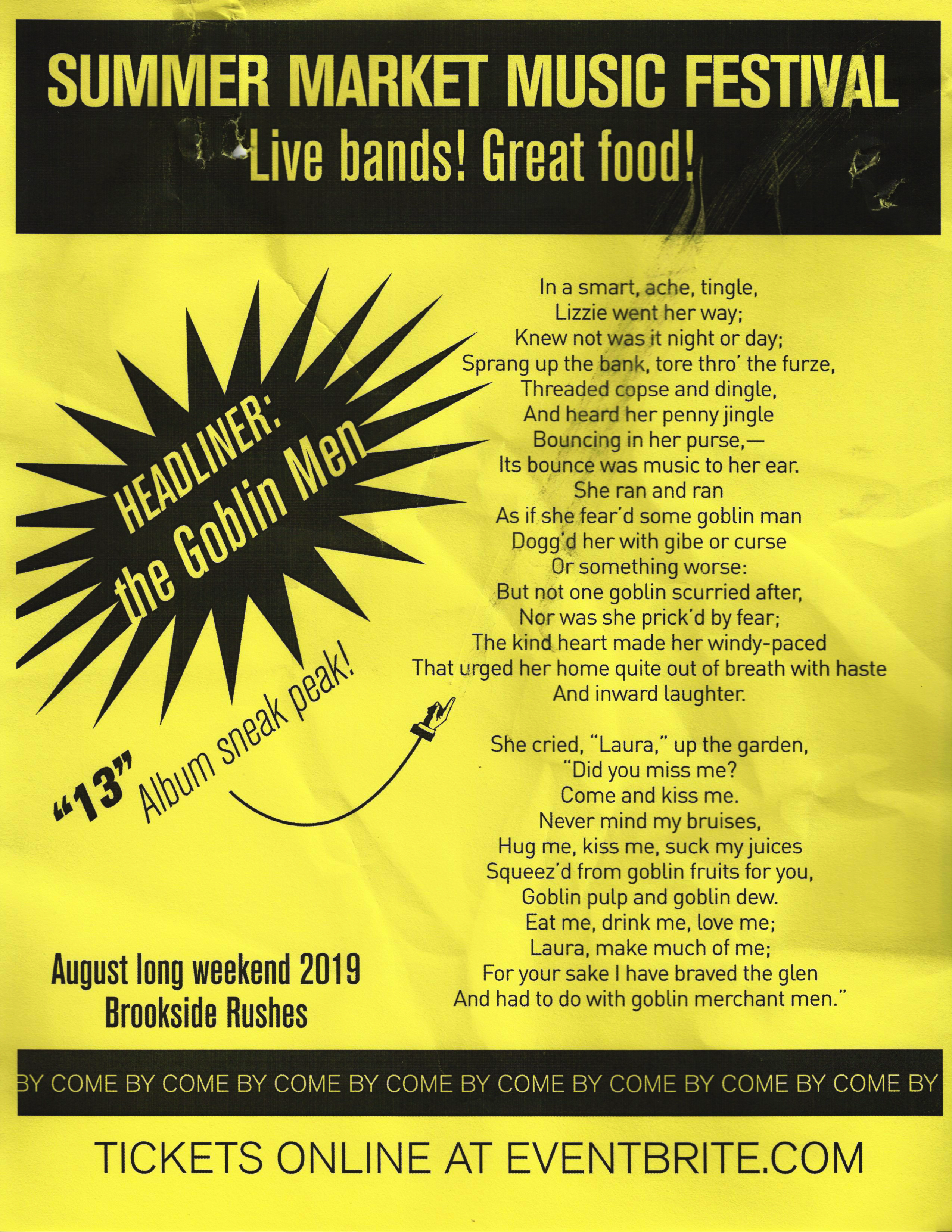
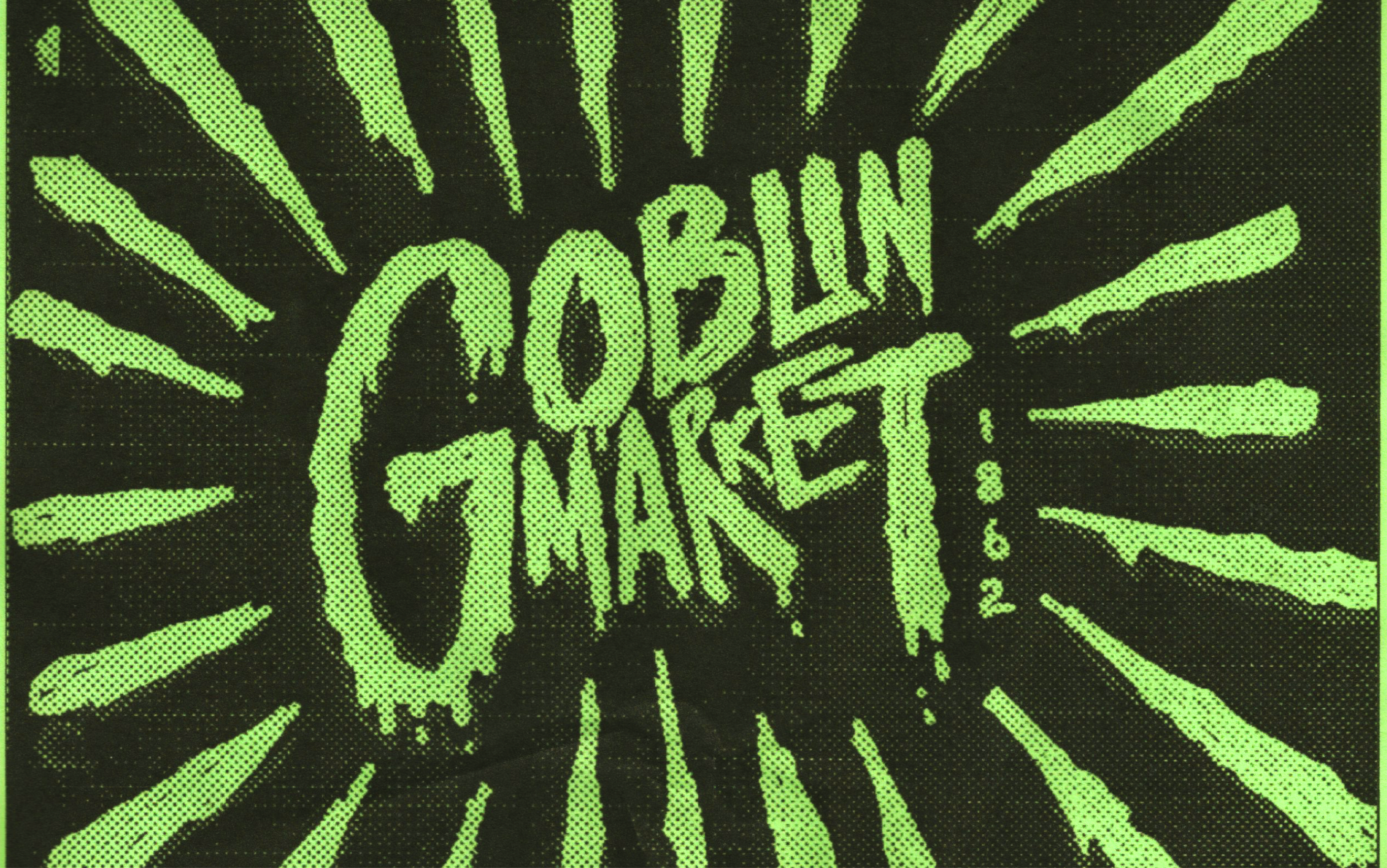
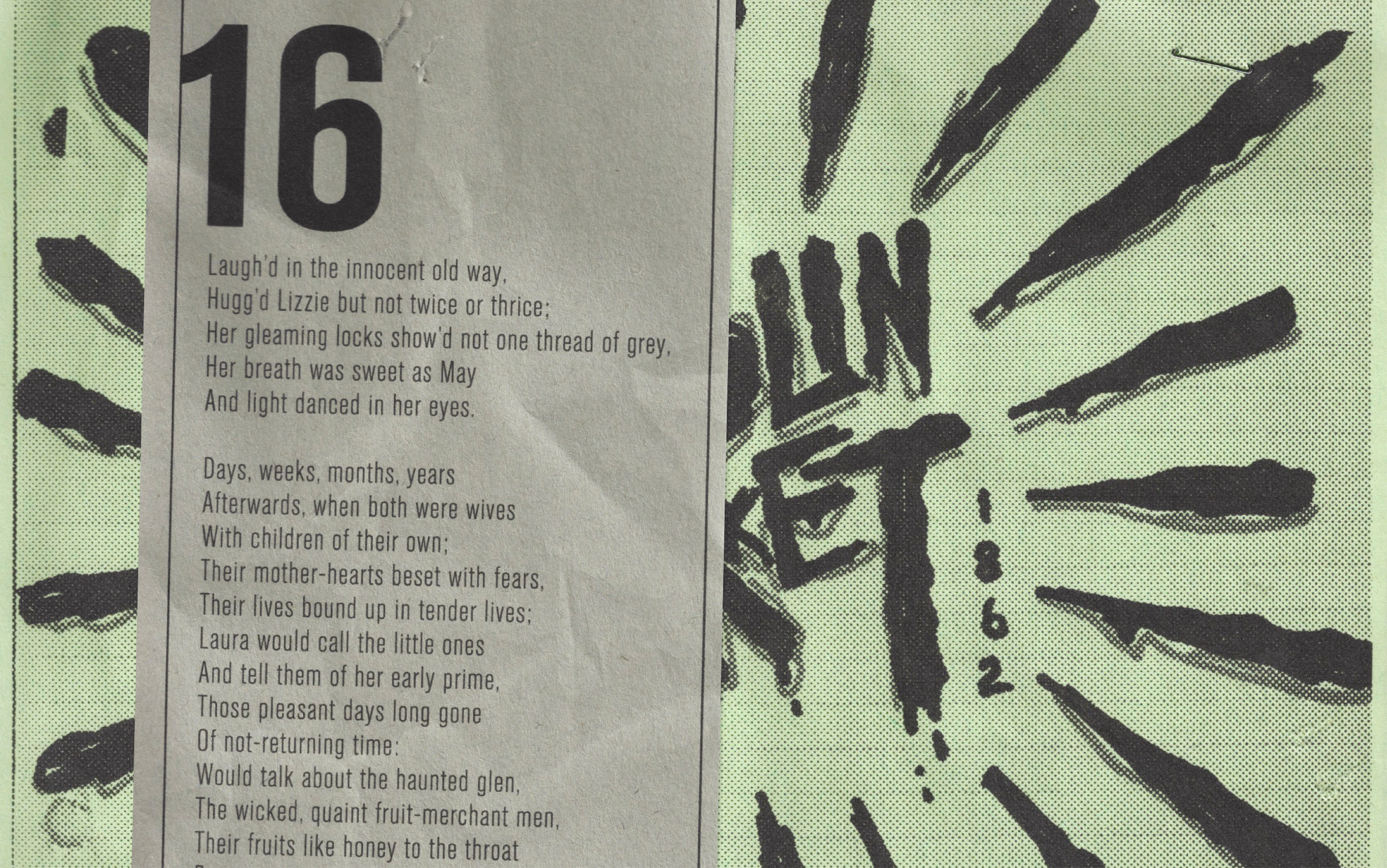
This project resituates Christina Rosetti’s 1862 narrative poem, “The Goblin Market”, in the format of a wall of flyers.
The poem follows two women, Laura and Lizzie and their encounters with the goblin men and their irresistible market of forbidden fruit. The goblin men are cunning and malicious, constantly bombarding the women with calls of “come buy, come buy!”. Interpretations of the poem range from a commentary on sexual assault and an expression of feminist and homosexual politics to an endorsement of the biblical image of the “fallen woman”, with its overt references of “forbidden fruit”. Critics have also pointed out that the story may have an anti-semetic nature, shown in the characterization of the goblins against the pure, christian-coded main characters.
The poem follows two women, Laura and Lizzie and their encounters with the goblin men and their irresistible market of forbidden fruit. The goblin men are cunning and malicious, constantly bombarding the women with calls of “come buy, come buy!”. Interpretations of the poem range from a commentary on sexual assault and an expression of feminist and homosexual politics to an endorsement of the biblical image of the “fallen woman”, with its overt references of “forbidden fruit”. Critics have also pointed out that the story may have an anti-semetic nature, shown in the characterization of the goblins against the pure, christian-coded main characters.
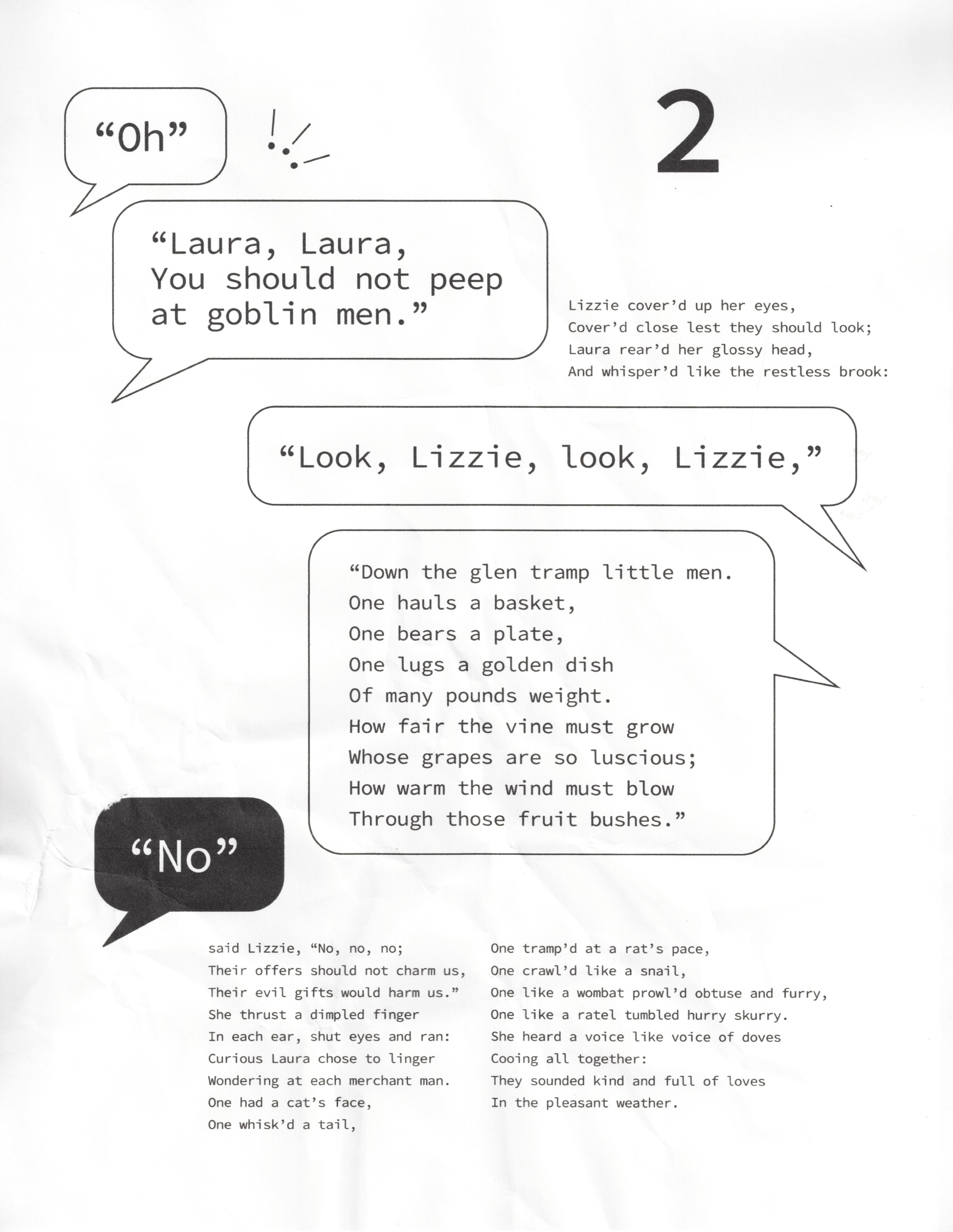
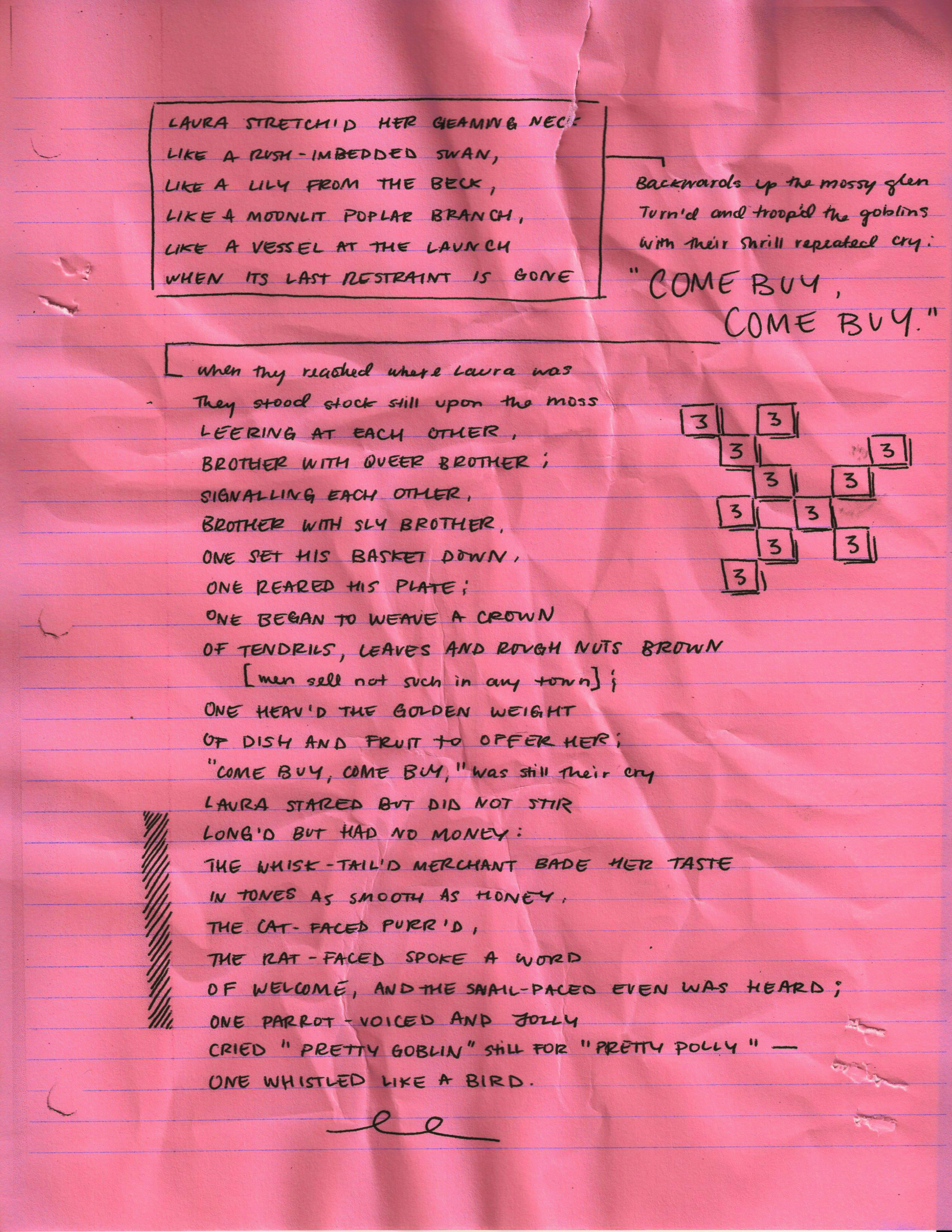
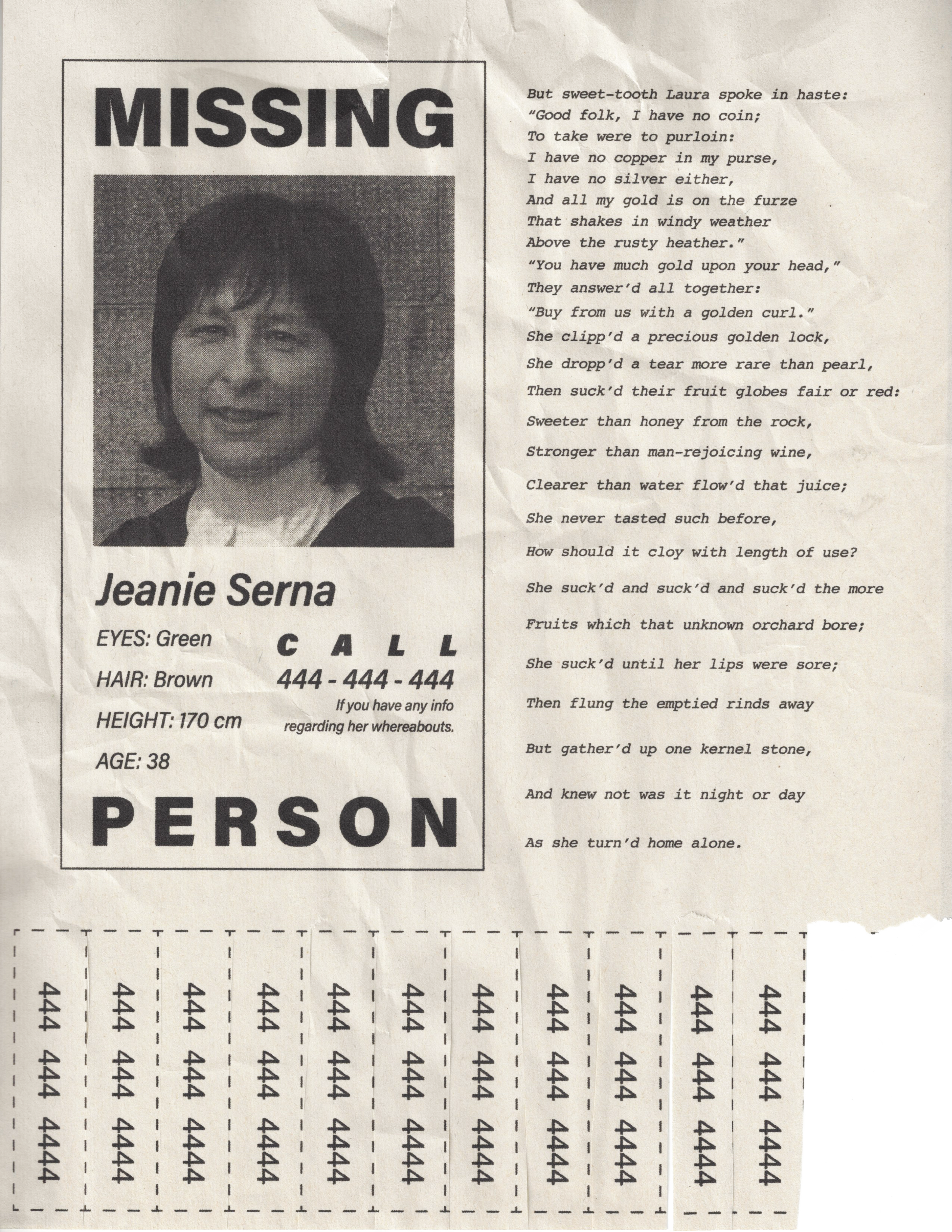
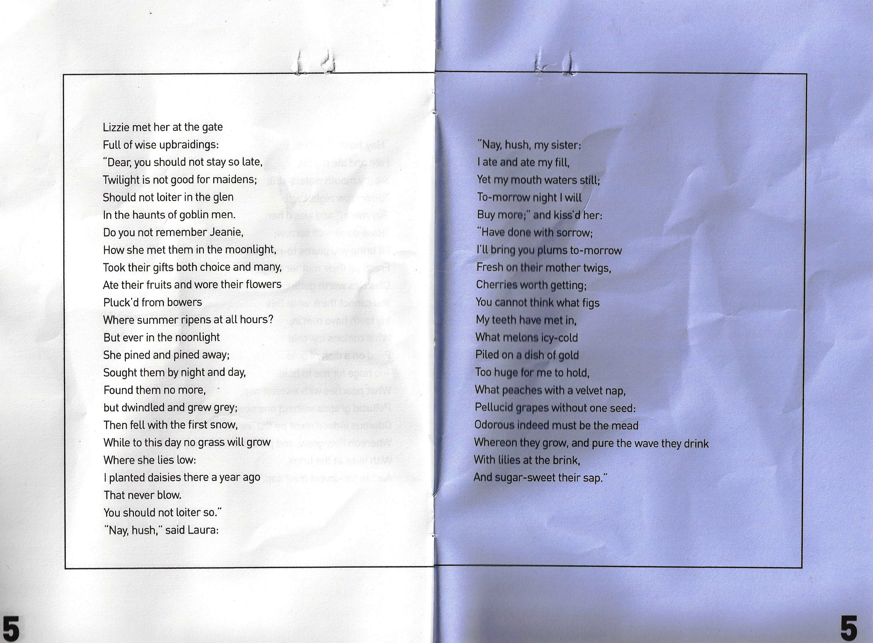
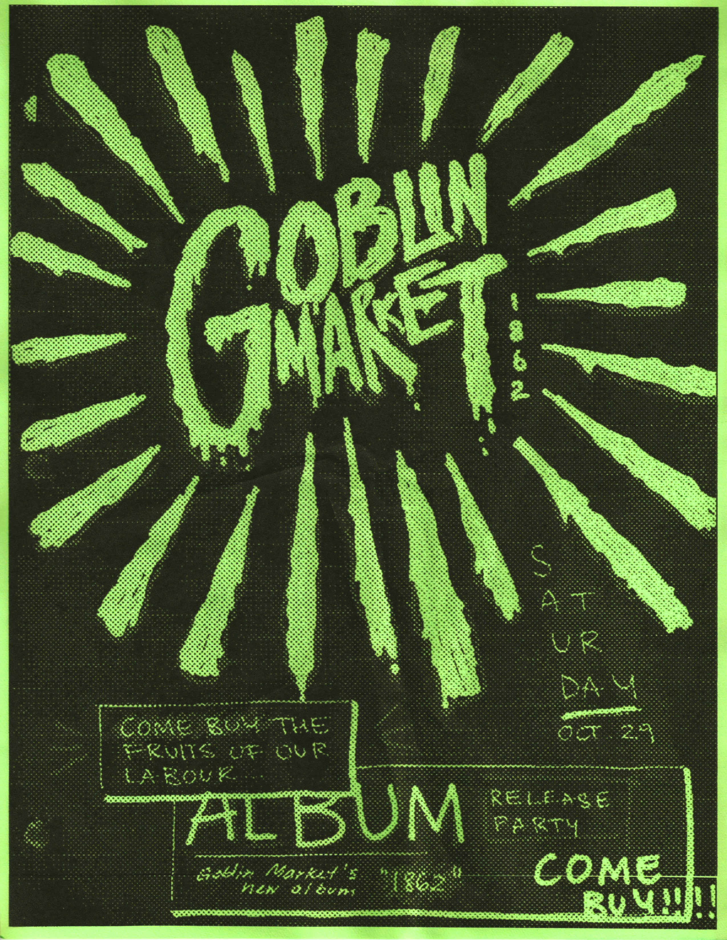
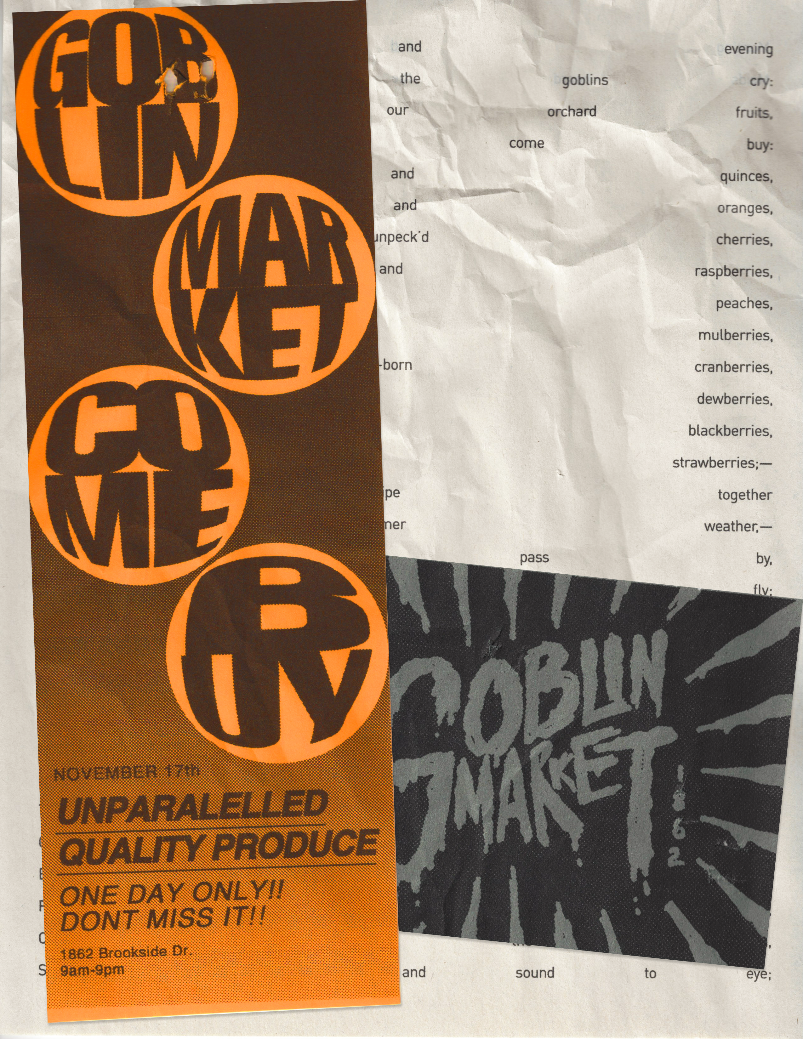
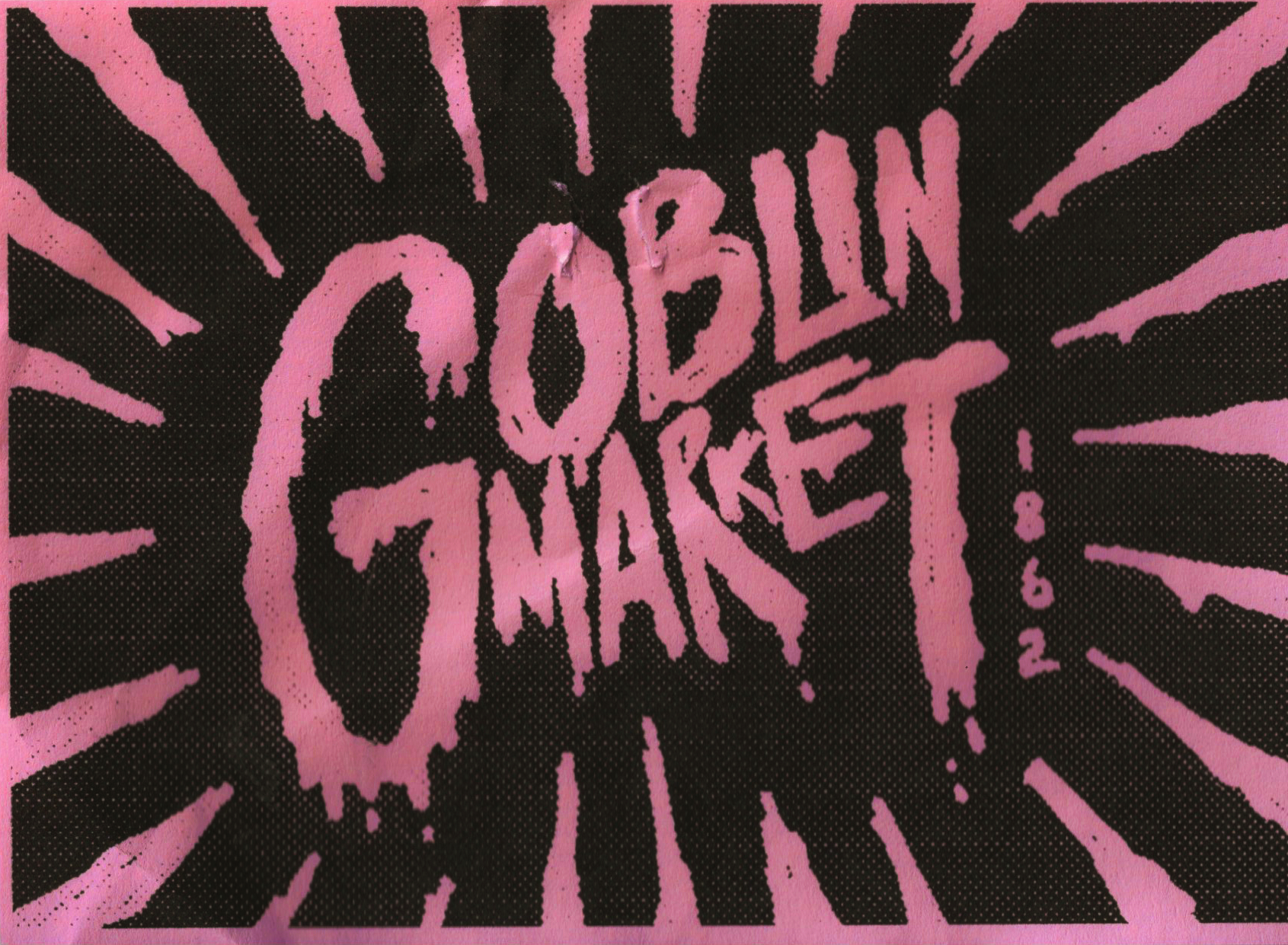
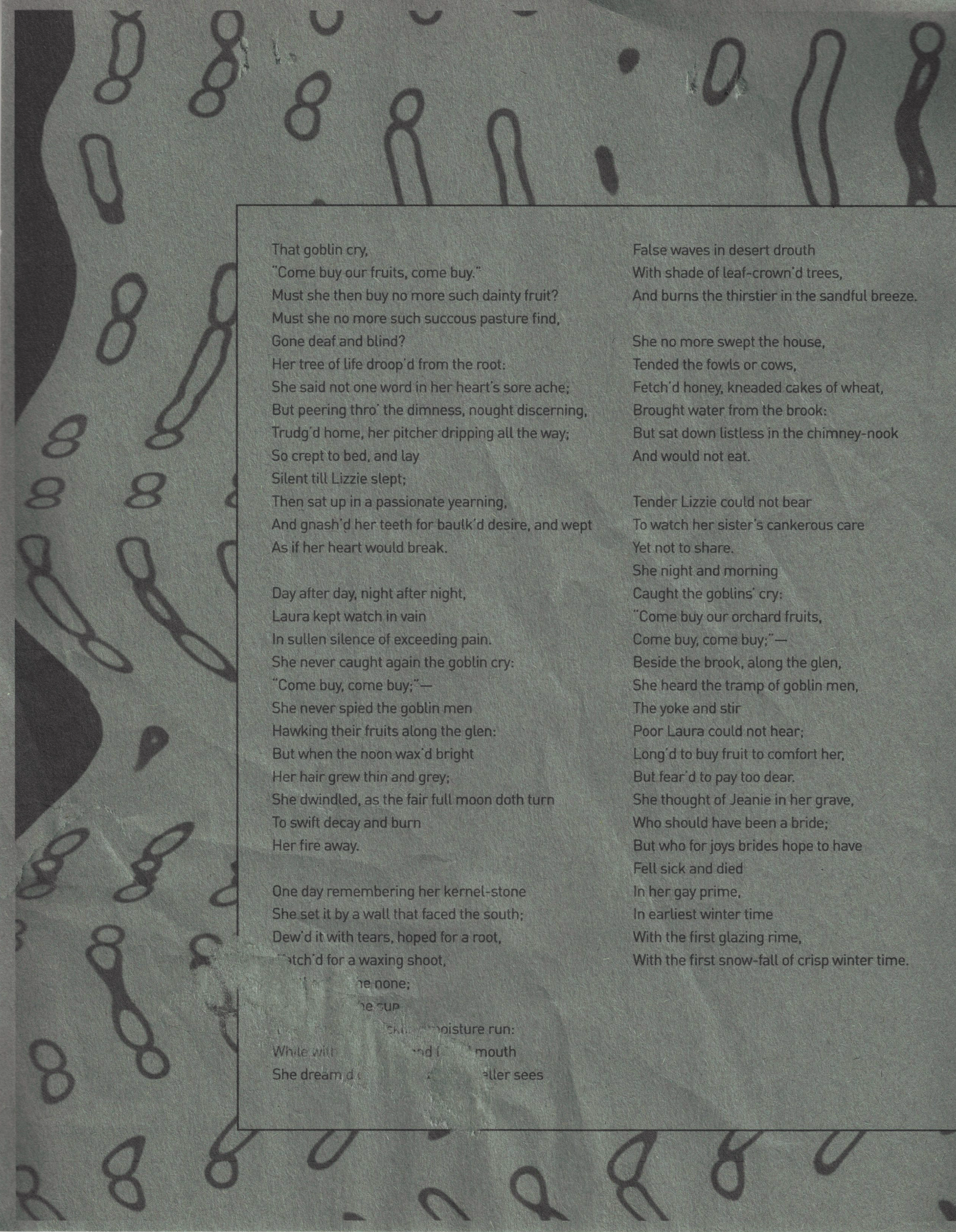
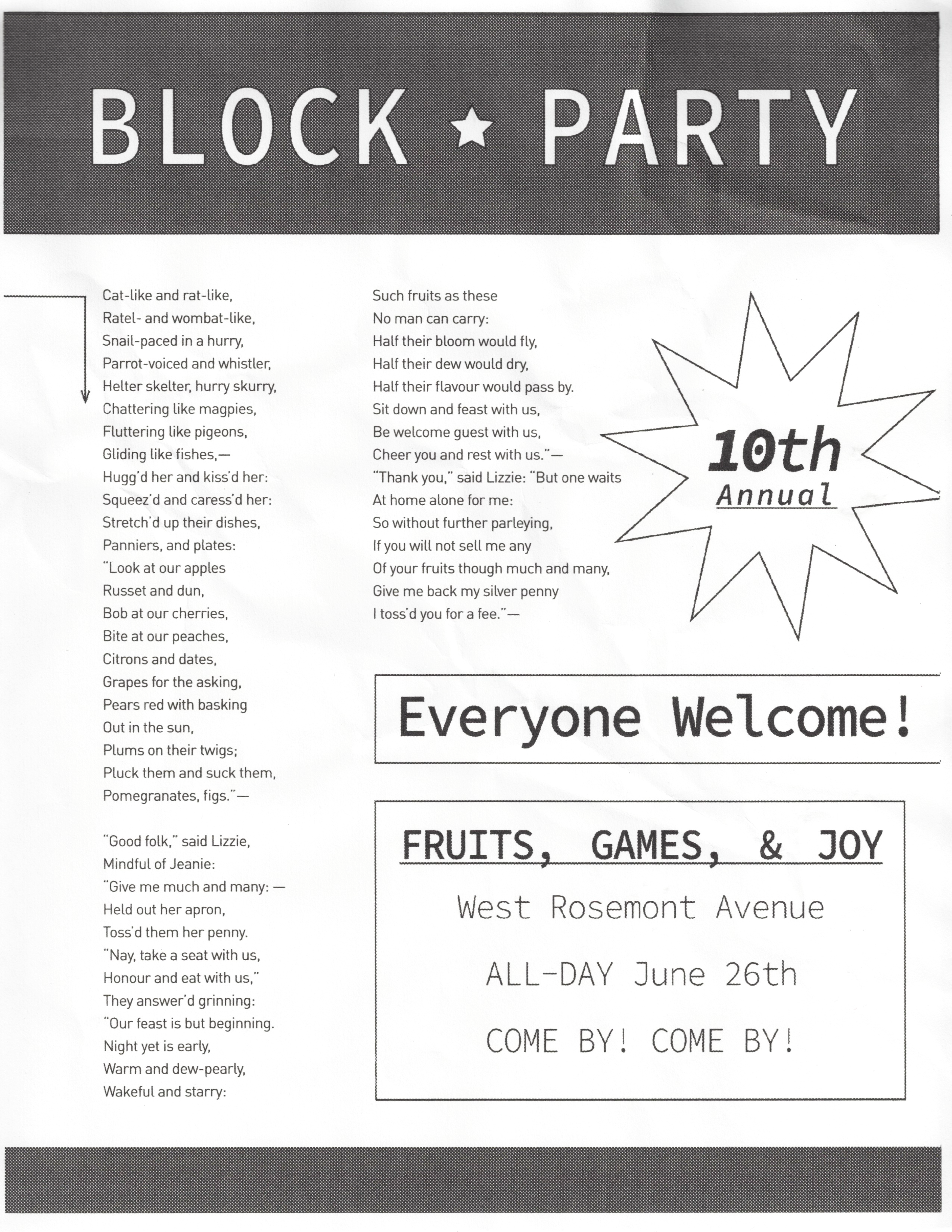
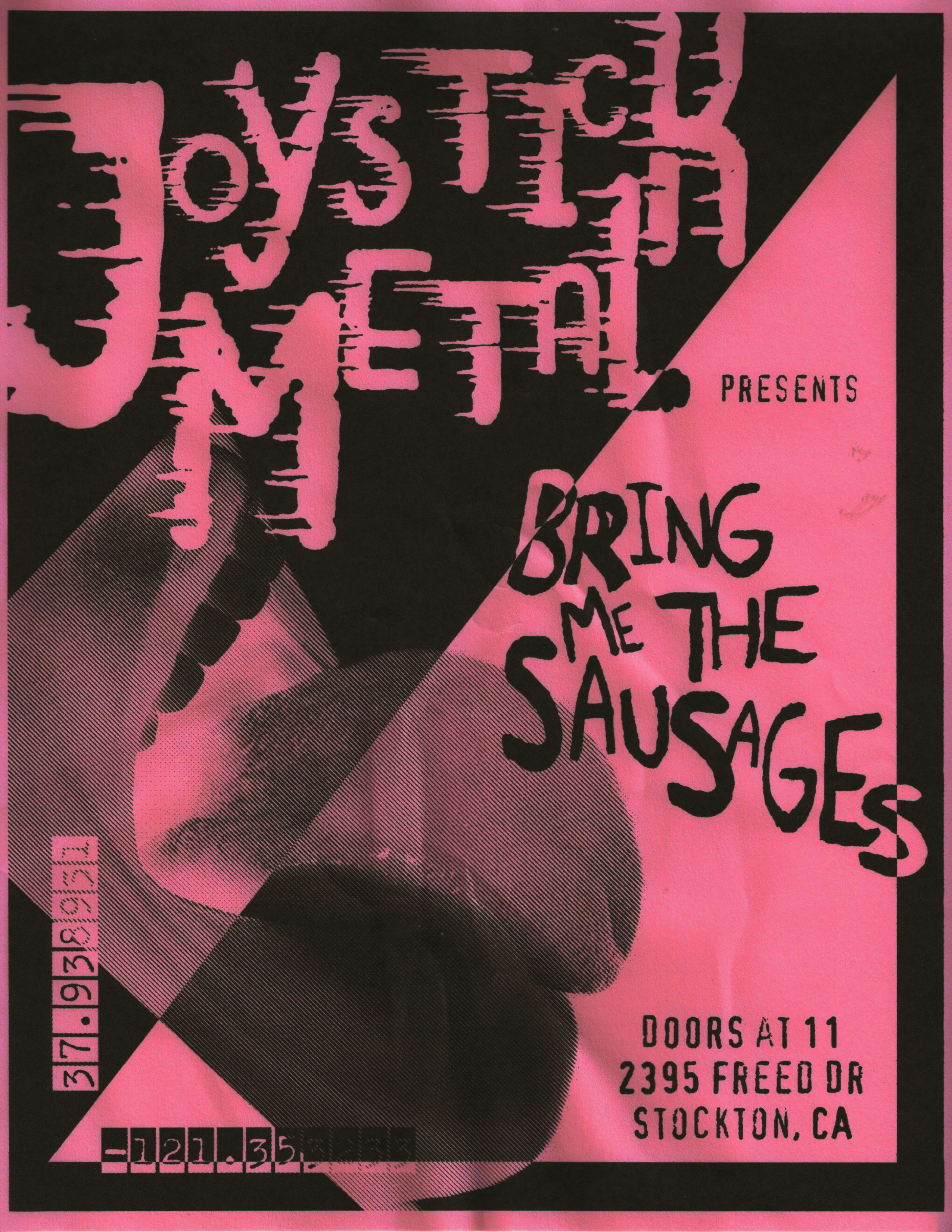
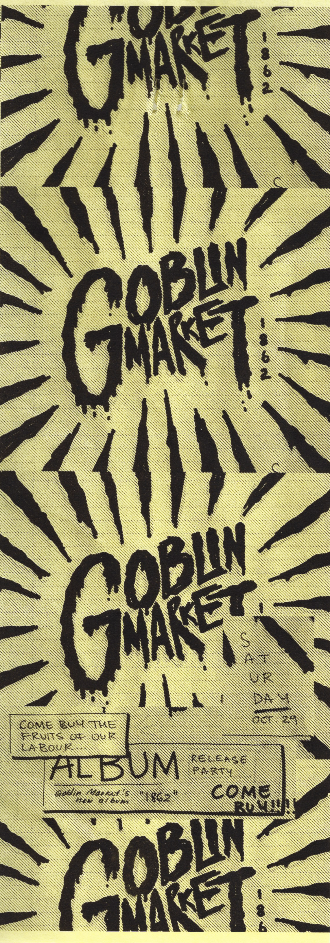
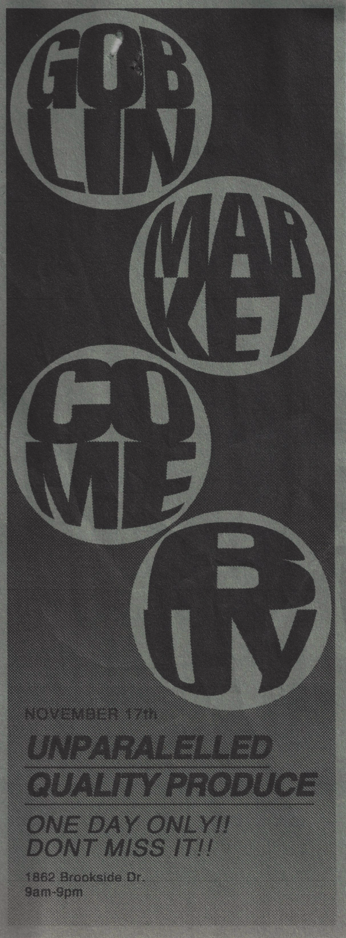
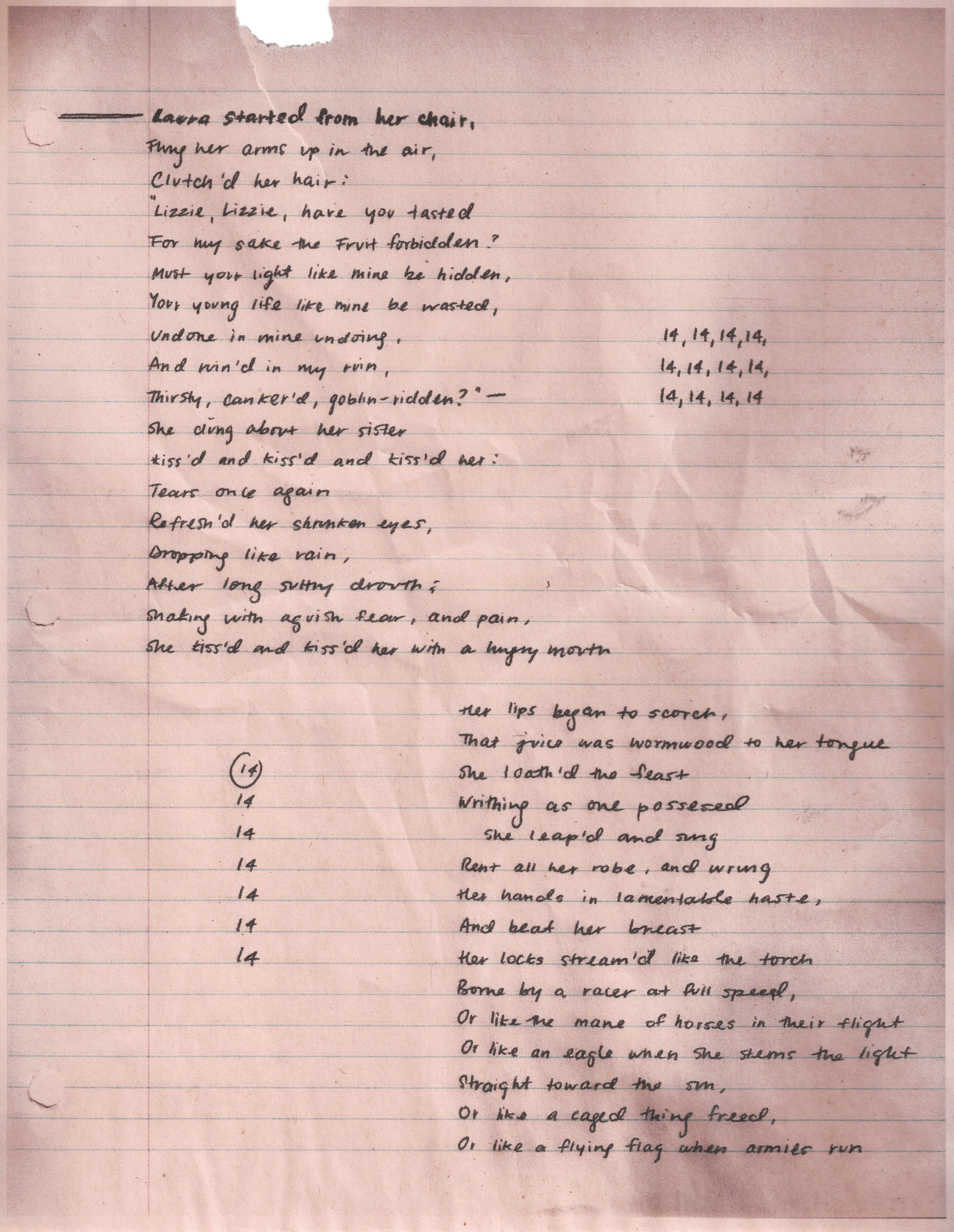
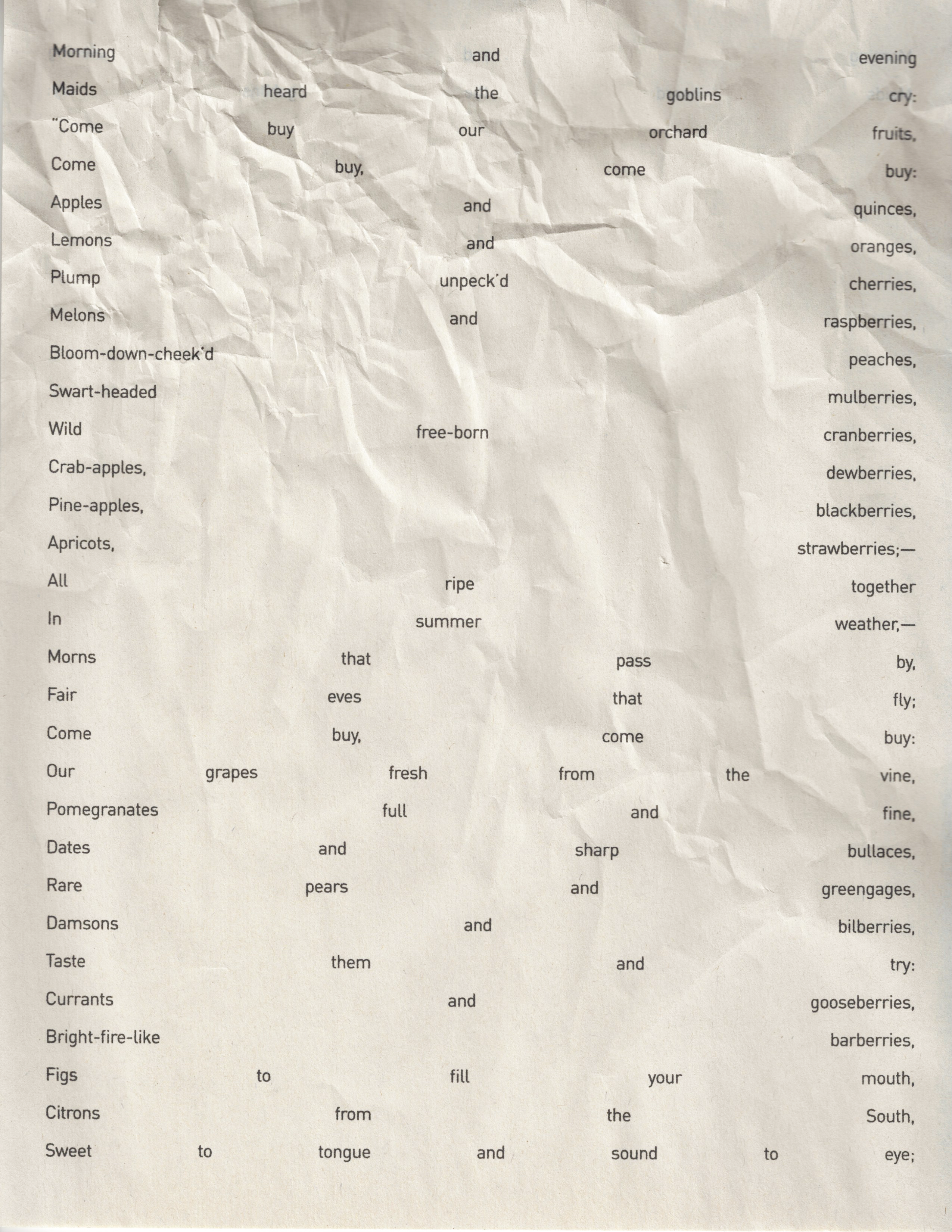
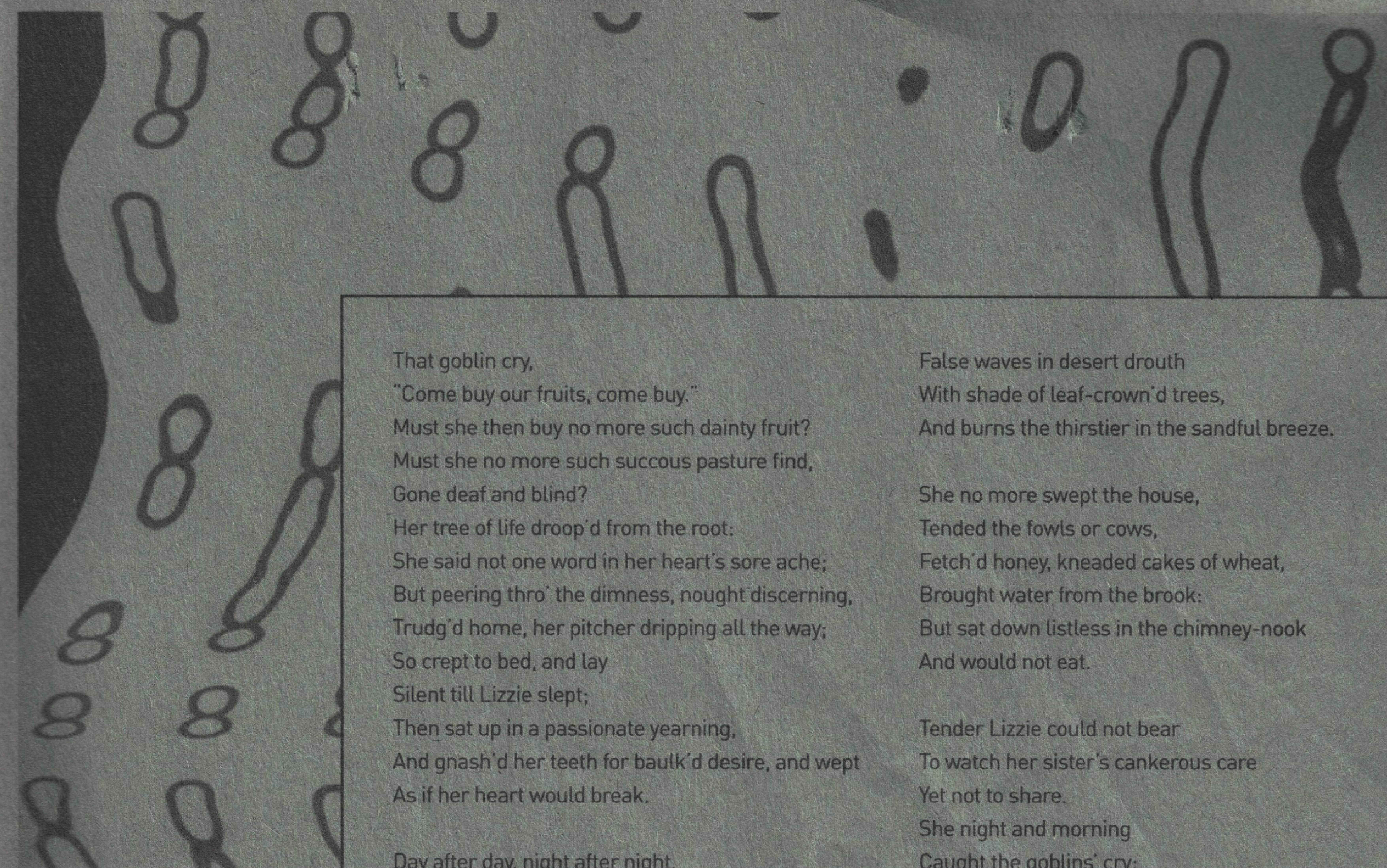
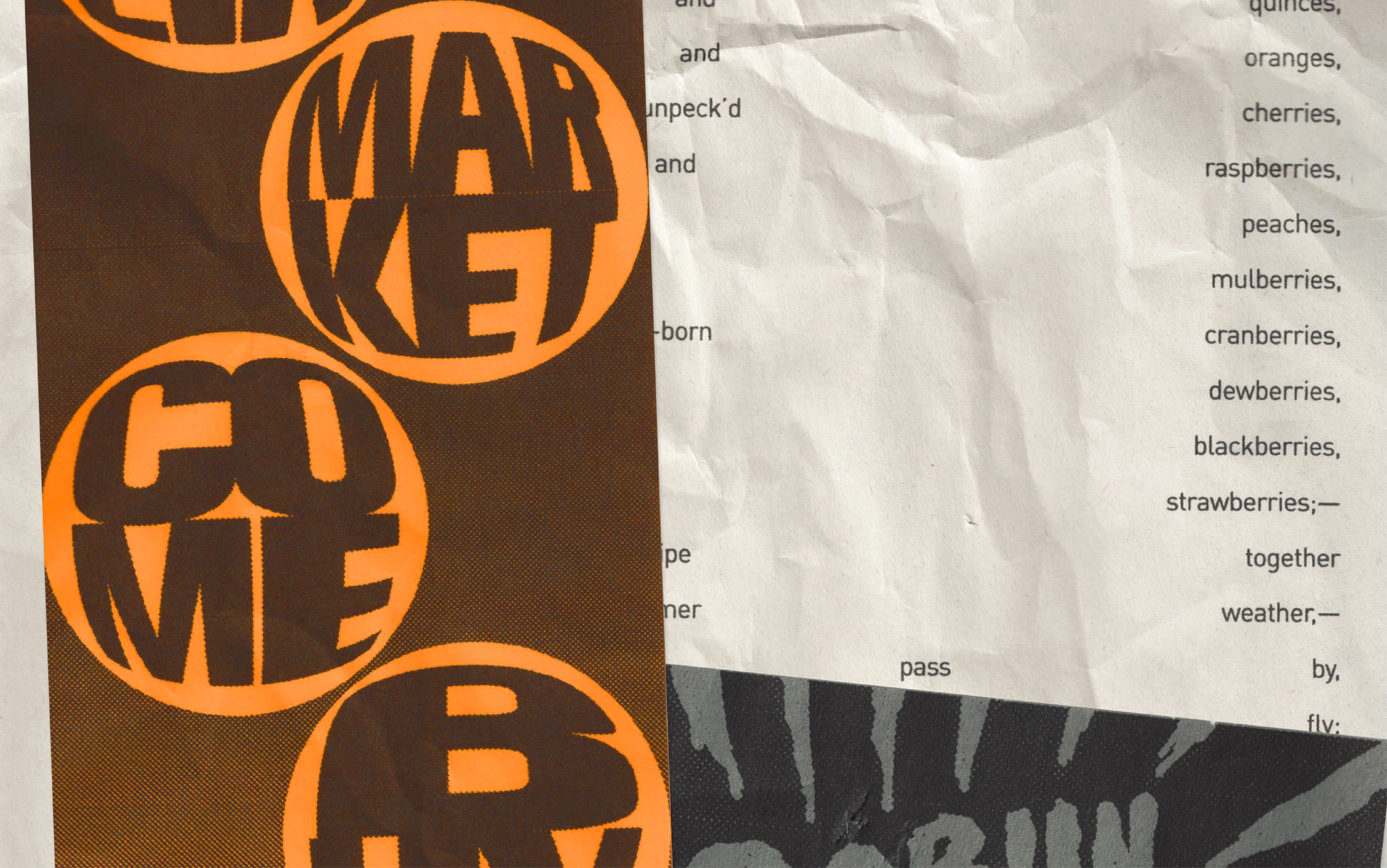
I chose to focus on the theme of seduction, one of the primary elements driving the story, and to try and represent the aggressive but magnetic nature of the advertisement present in the poem’s narrative. I also wanted to show the coarse and obnoxious undertone by presenting the poem through brash and colourful flyers. I wanted the whole project to feel realistic enough to appear as a real wall of flyers, and as such all the narrative pages have a deliberately simple and banal structure.
The text of poem is split onto 16 different pages, each one sublty, or not so sublty, numbered to aid the reader in following the storyline. Along with the 16 narrative flyers, there are various collateral flyers that illustrate the tone of the project as well as the acts of advertisement that are present in the poem.
